
Key Takeaways
- Begin with what attendees need to do, not with your organization’s background.
- Use plain language, descriptive headings, readable type, and strong contrast.
- Keep dates, times, locations, costs, contacts, and accessibility details easy to find.
- Offer information in more than one format when your audience may need it.
- Test the draft with people who are unfamiliar with the event before printing in volume.
A printed guide can help visitors find the right room, understand a schedule, and take part without needing to search a website or ask staff for every detail. Whether you are planning a school open house, library workshop, museum program, neighborhood fair, or volunteer event, custom booklet runs for small businesses can provide a practical format for organizing essential information in one easy-to-carry piece.
The best guides are built around the reader’s immediate needs. They make the event’s purpose, time, location, access details, and next steps obvious at a glance, then use the remaining space to answer the questions people are most likely to have.
Why Printed Guides Still Matter
Printed materials remain useful in places where people are moving between rooms, waiting in line, navigating an unfamiliar building, or conserving phone battery. A guide can also support visitors who have limited internet access, do not use smartphones, or simply prefer a physical reference they can mark up and keep.
A handout works best when it supports a clear task. It might help someone locate registration, compare activities, follow a route, prepare for a workshop, or contact the right person. If a detail does not help with one of those tasks, consider leaving it out or moving it to a website.
Define the Reader and the Main Task
Before choosing colors, photos, or paper size, identify who will use the guide. Parents arriving for a school event need different information from volunteers at a food drive or visitors attending a community arts class.
- Name the primary audience and any secondary audiences.
- List the questions they may ask before and during the event.
- Choose one primary purpose, such as finding activities or completing check-ins.
- Remove internal jargon, staff-only notes, and background details that slow readers down.
Build a Simple Information Structure
Arrange information in the order a first-time visitor needs it. Put practical details near the front, rather than requiring readers to search through introductory material.
- State what the event or program is.
- Show the date, time, address, and entry point.
- Explain who can attend and whether registration is needed.
- List what people should bring, wear, or prepare.
- Present the schedule, activities, or participation steps.
- End with contact details and instructions for follow-up.
Use Plain Language and Short Sections
Clear writing reduces effort for every reader. Federal plain-language guidance emphasizes writing for a specific audience and testing whether people understand the information. Apply that approach to print by choosing familiar words, short sentences, and direct instructions.
Turn Dense Notices Into Useful Checklists
Instead of writing, “Participants are encouraged to arrive in advance of the program commencement in order to complete required registration procedures,” write: “Arrive by 9:30 a.m. Check in at the front desk before the 10:00 a.m. program.”
Use bullets for supplies, rules, options, and steps. Explain unfamiliar terms the first time they appear. Give each section one job, such as “Getting Here,” “Today’s Activities,” or “What to Bring.”
Make the Layout Easy to Scan
People often consult an event guide quickly, while standing or walking. Use clear headings, visible page numbers, consistent alignment, and enough open space around text blocks. Keep related details together, such as pairing each activity time with its room or meeting point.
- Use headings that describe the content beneath them.
- Reserve bold text for the most important information.
- Use icons only when their meaning is immediately clear.
- Do not depend on color alone to distinguish groups, routes, or deadlines.
- Check that maps include labels, landmarks, and a clear “You Are Here” point when appropriate.
Choose Readable Type and Contrast
Select a clean, familiar typeface and avoid long passages in all capital letters, narrow columns, or very small text. Make sure the difference between text and its background remains easy to see in ordinary indoor lighting. A grayscale printout is a useful check because it reveals whether color is carrying too much meaning.
For public-facing programs, accessibility is not only a design preference. The Department of Justice’s effective communication guidance explains that communication needs can vary with the person and the context. Offer a large-print edition, accessible digital copy, translation, or another format when it is appropriate for the audience.
Plan for Different Access Needs
Help people prepare before they arrive. Clearly mark accessible entrances, restrooms, seating, quiet areas, drop-off points, parking, transit options, and service-animal information where relevant. Include a phone number or in-person contact option instead of relying only on an online form or QR code.
If your community uses more than one primary language, prioritize translating the information people need to attend safely and successfully. Keep translated content close to the corresponding English details so readers do not have to compare separate sections.
Organize Schedules, Directions, and Images
Use a one-time format consistently and put a location beside every activity. Group sessions by day, room, age range, or activity type, depending on how attendees will make decisions. Clearly identify breaks, check-in windows, meal times, and closing times.
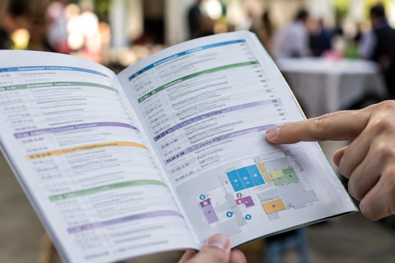
Images should clarify an action, route, object, or location. Decorative graphics are optional, but directions and labels are not. If you include a map, use numbered route steps, and add a short “Start Here” section for first-time visitors.
Add a Quick-Reference Page
A one-page summary gives attendees a fast answer when they do not have time to read the full guide. Include the day’s schedule, important phone numbers, key locations, accessibility information, emergency instructions, and a short list of frequently asked questions.
Review Before You Print
Internal approval is not enough because staff members already understand the program. Ask several people who have not helped plan the event to complete simple tasks using the draft, such as finding the registration desk or locating a workshop room. Note where they pause, what they miss, and which terms confuse them. Revise repeated problems before ordering a full run.
Prepare Print and Digital Versions Together
Keep the core facts identical across formats, especially dates, locations, contact details, and access instructions. A QR code or short web address can provide updates, but the printed guide should still work on its own. When a detail changes, update both versions immediately.
Final Checklist
- Is the purpose clear within a few seconds?
- Can readers quickly find the date, time, location, and cost?
- Are directions accurate and presented in order?
- Is the text readable in normal lighting?
- Does the guide address likely access needs?
- Have unfamiliar readers tested it?
- Do print and digital versions match?
A strong printed guide does not attempt to say everything. It helps people do what they came to do with less uncertainty. Thoughtful structure, clear language, readable design, and real-world testing can turn a basic handout into a reliable tool for any event or community program.
